Retailer overview
A better way to browse retailers on Weedmaps
Role: Lead Product Designer, User Researcher
Platform: Responsive Web, iOS, Android
Year: 2021
The challenge
Weedmaps has been the go-to destination for customers to find the best cannabis dispensaries and delivery services since 2008. To encourage orders, users were funneled into retail menu pages to make an immediate purchase. However, through qualitative and quantitative research, we discovered that funneling users directly into the menu did not align with prominent use cases: product discovery, comparison shopping, and deal hunting to name a few. Determined to redesign the shopping experience to accommodate for high priority use cases, we challenged ourselves: How might we create a shopping experience that provides a high-level view of the retailer while also offering a granular look at live inventory and available services?
Understanding needs, wants, and expectations
User testing
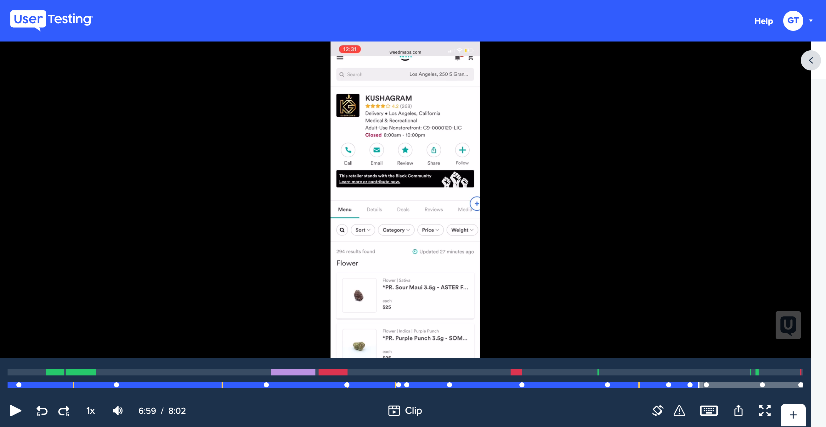
After making a test plan and writing a script, I ran some initial user tests. This was comprised of 10 participants (5 storefront and 5 delivery) completing a series of tasks and questions about the current retail experience. The goal was to highlight its failures, successes, and areas of improvement.
Key insights:
- Users are price conscious
- Users want to learn more about the business and its practices (reviews, fees, amenities, social causes, etc.)
- Users want to see an overview of the menu (categories, menu counts, product offerings, etc.)
- We shouldn’t remove any sections already being displayed
- Interior and exterior photos of dispensaries can help with users’ feelings of trust and safety
- Delivery details shouldn’t be restricted to order online enabled retailers
Card sorting
Additionally, to stack rank information already being displayed on retail pages, I also conducted a series of card sorting exercises with 80 participants (40 storefront and 40 delivery). Each one had to take a set of data points and organize them into 4 different categories—“very important to me when choosing a dispensary,” “somewhat important to me when choosing a dispensary,” “not very important to me when choosing a dispensary,” and “doesn’t matter in my decision making when choosing a dispensary.”
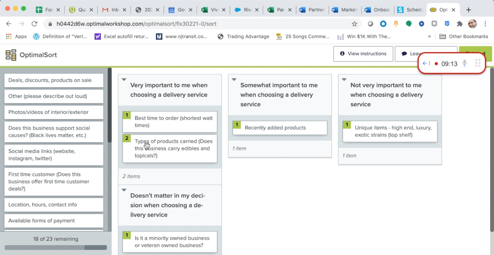
Top ranked results for storefronts:
- Location, hours, contact info
- Types of products carried (categories)
- Reviews & star rating
- COVID safety information
- Deals, discounts, products on sale
- Available forms of payment
- Size of menu (number of items carried)
- Popular products
- First time customer deals
- Best time to visit
- Support for social causes
- Recently added products
- About the business
Top ranked results for deliveries:
- Location, hours, contact info
- Types of products carried (categories)
- Reviews & star rating
- Available forms of payment
- Deals, discounts, products on sale
- COVID safety information
- Best time to order
- First time customer deals
- Size of menu (number of items carried)
- Support for social causes
- Recently added products
- Popular products
I was happy to learn that the results for both storefronts and deliveries were almost identical. Deciding on what sections to include for each type of retailer was going to be easy.
Interviews
Lastly, I met with customer support and sales. It was crucial that I spoke with them because they deal with our customers on a daily basis. According to them, the layout and design of the current retail pages left much to be desired. The cannabis industry has many confusing use cases, legalities, and terminologies, causing interfaces to be convoluted. Ours was no exception. One pain point that kept coming up was deciphering the different types of retailers. Despite it being included in the header, many users still noted their confusion. We need to do a better job explaining and highlighting certain things to our users.
Ideating solutions
Now that I had an idea of what and who to design for, it was time for sketches, wires, and concepts. This was my favorite part of the design process. I could let loose, be creative, and not think too much about constraints and limitations. That can come later.
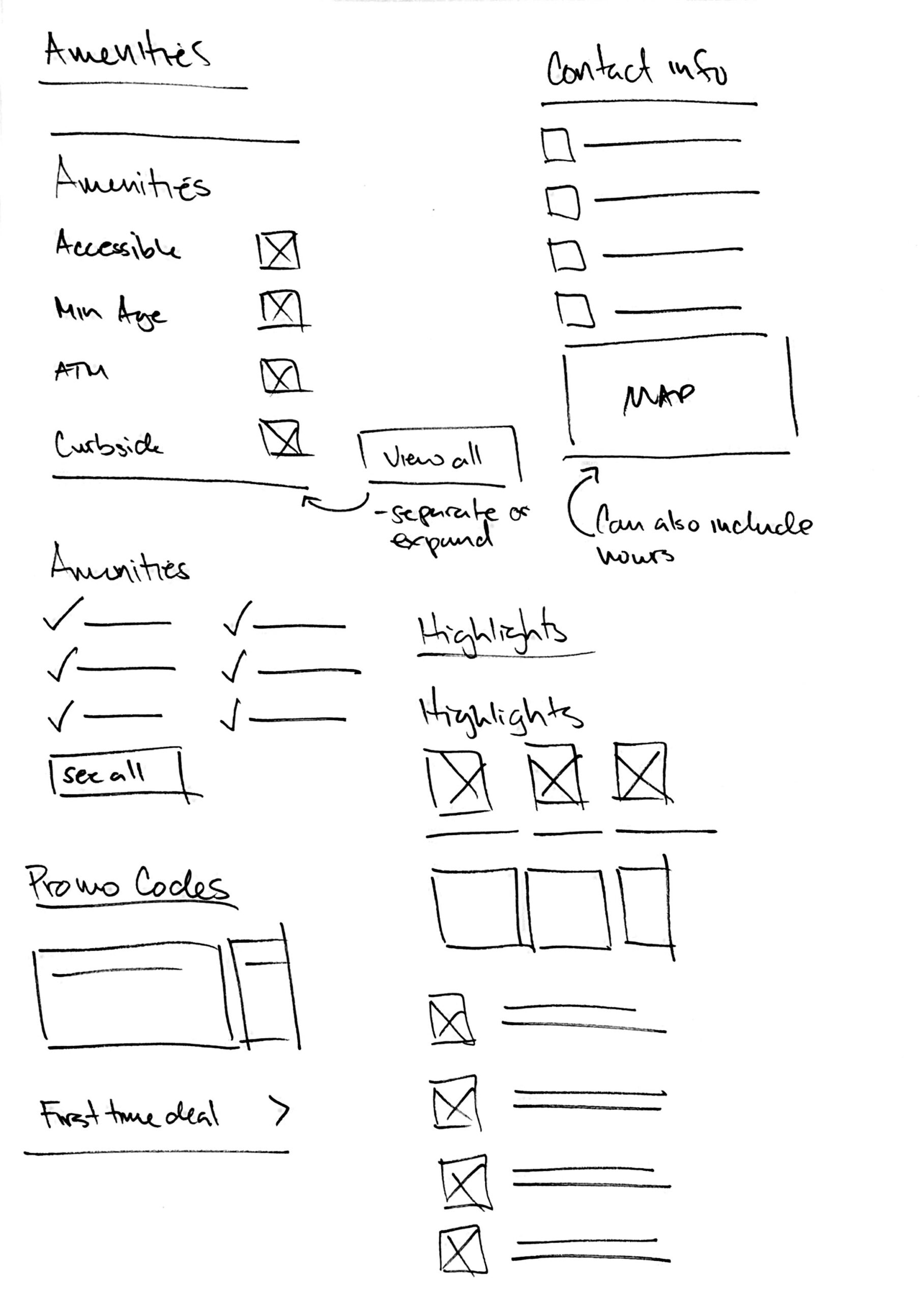
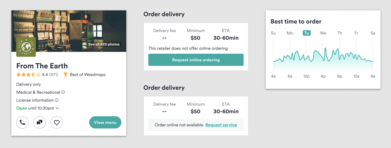
Due to technical limitations and business constraints, we did have to forego a number of items: header images, best time to visit/order module, and the ability to request online service. The team believed we would still have an effective release, even if those features came at a later date.
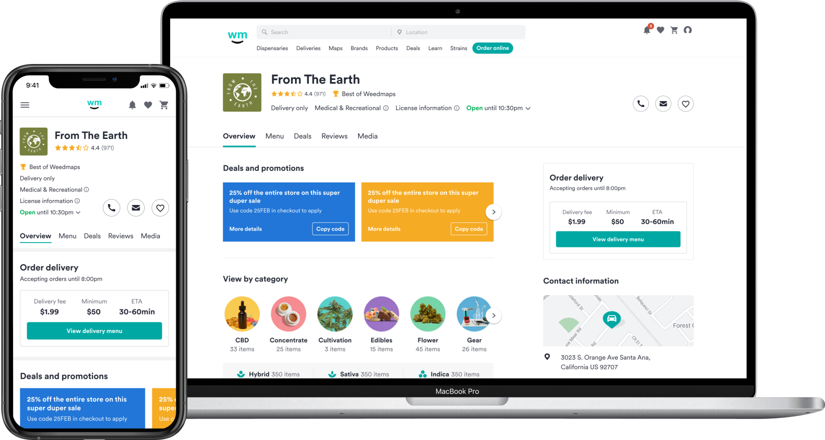
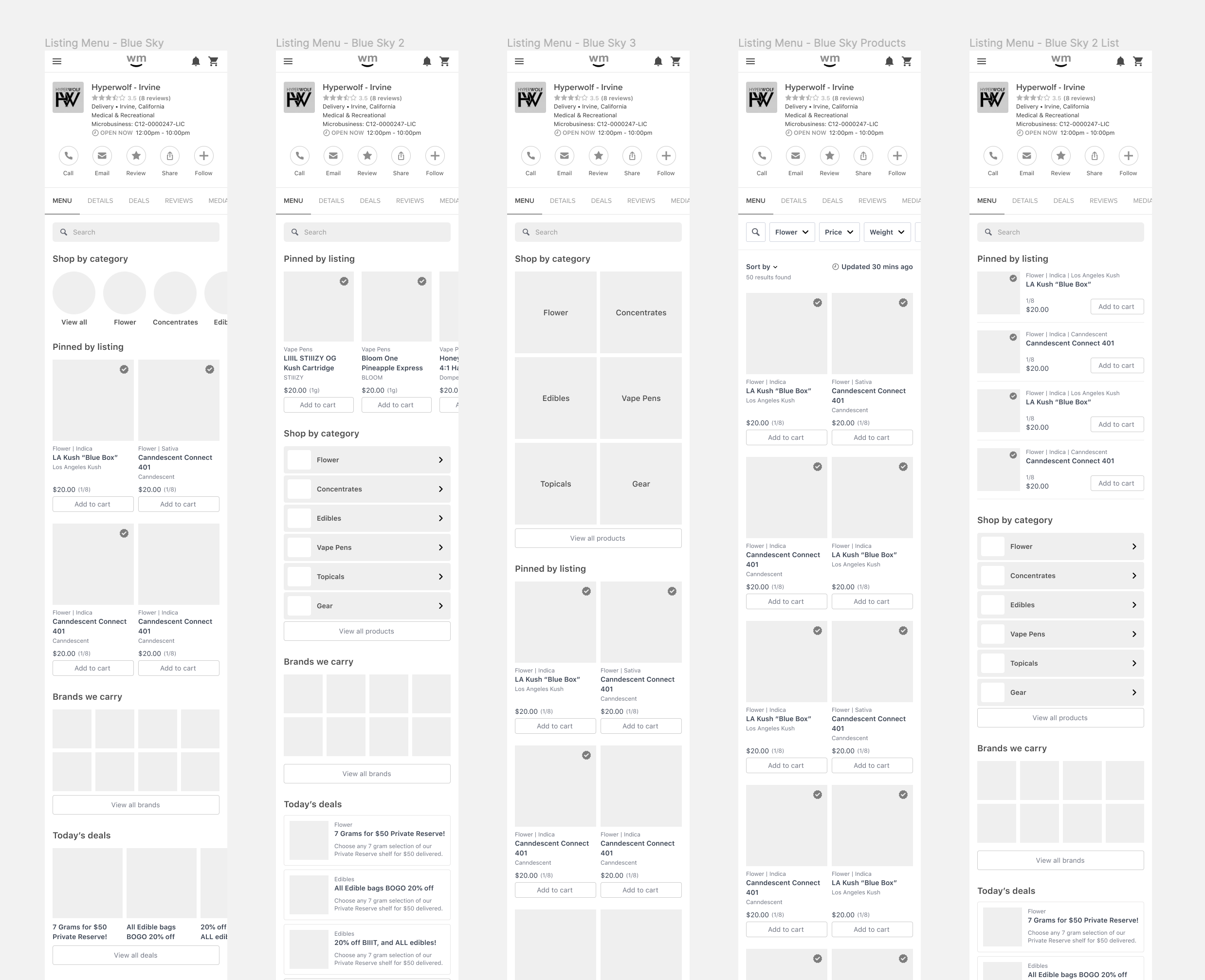
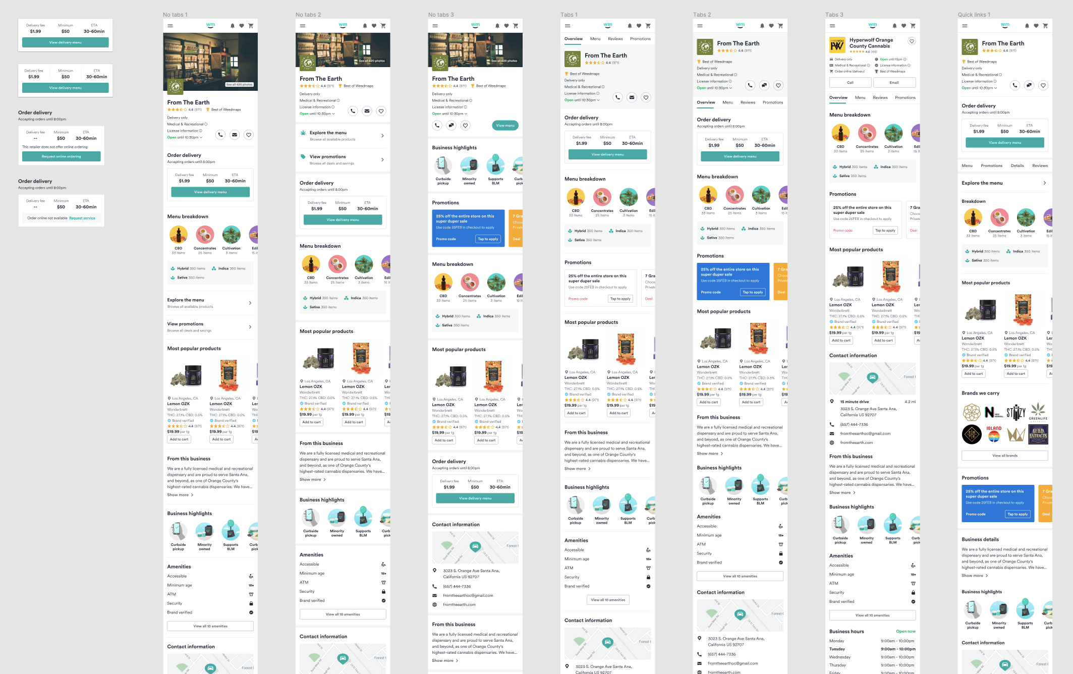
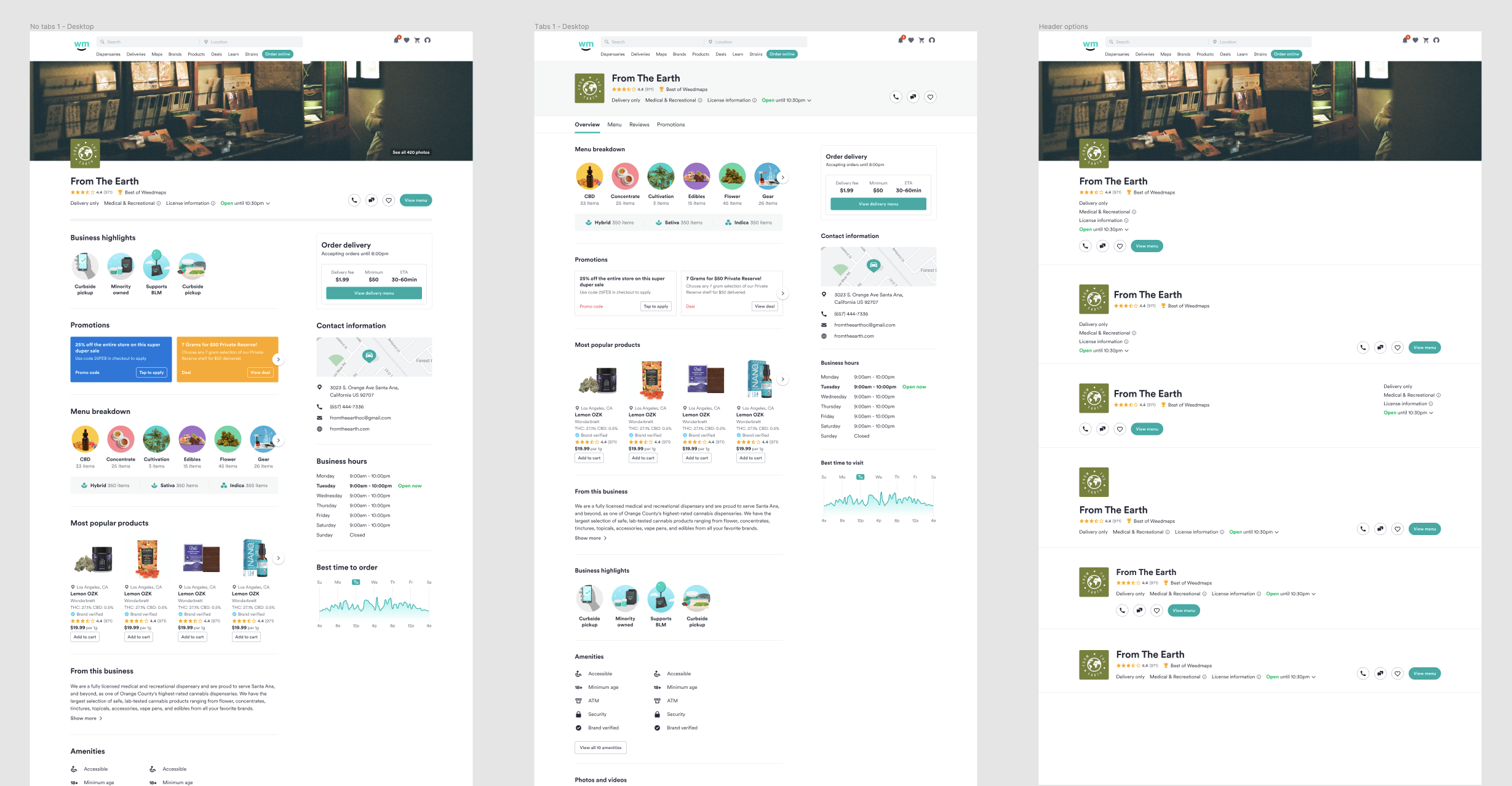
Retailer overview
The information important to our users was hidden behind multiple clicks, so I redesigned the listing page to surface the right information at the right time, allowing users to purchase more confidently.
Notable sections...
Redesigned header
While the previous header was jam-packed with extraneous information, the new header surfaces the right information at the right time with appropriate CTAs to guide users to their desired path.
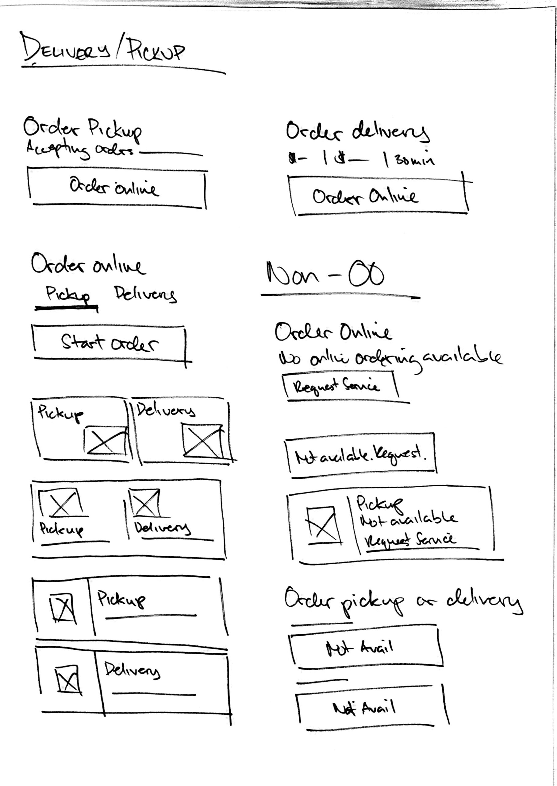
Order online - delivery and pickup details
Because the different types of retailers continue to confuse users, a module highlighting delivery and pickup details was designed. This lets the user know if a retailer is a storefront or delivery service, as well as if they’re able to accept orders online.
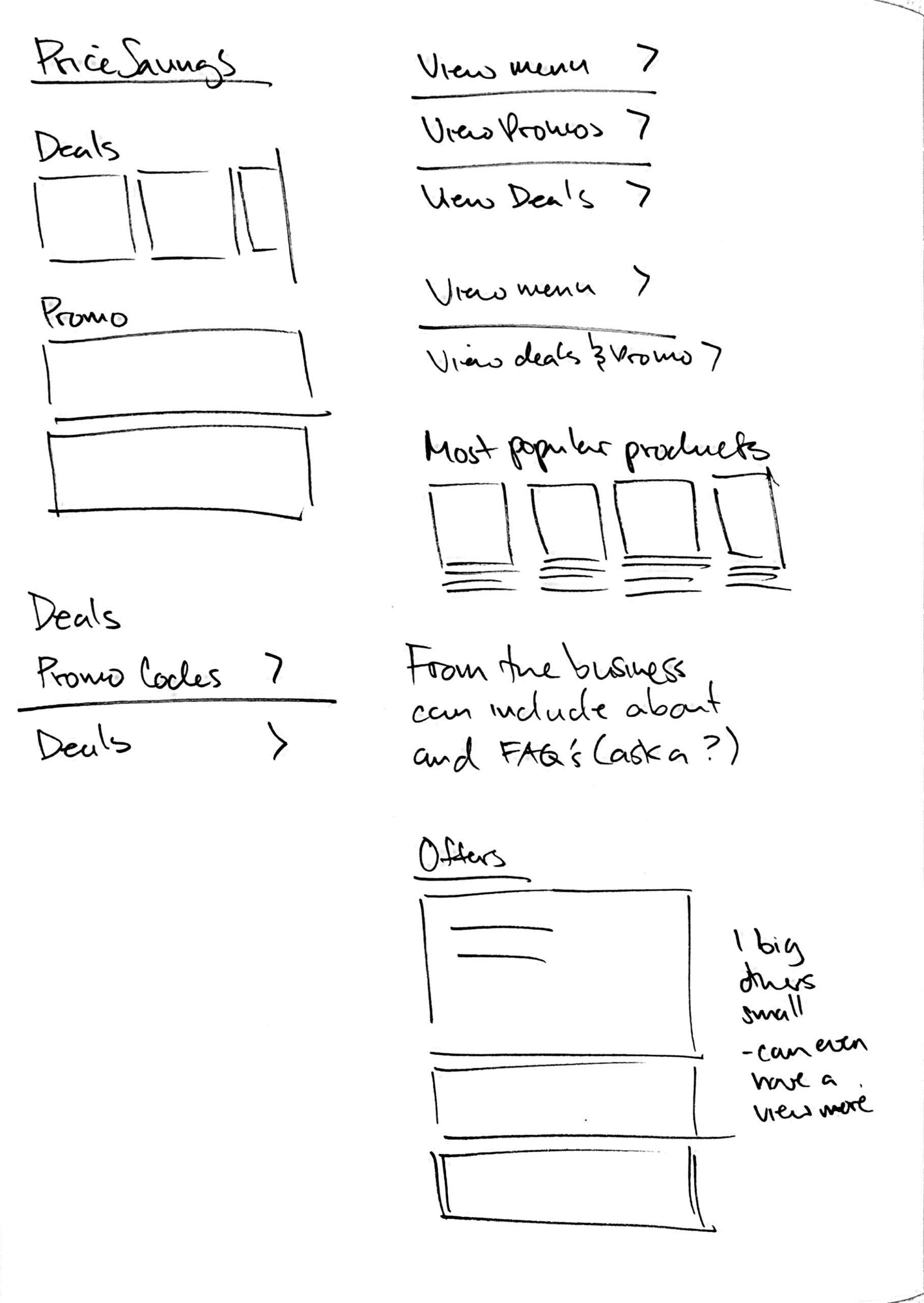
Deals and promotions
For consumers, deals and promotions was mentioned by every participant in the user tests. It was also one of the top ranked categories in the card sorting exercise.
For the client side of the business, deals and promotions are a big money maker. Clients know how price conscious their customers are, so any extra ad coverage (especially FREE) will always be appreciated.
Now instead of being hidden behind another click, it gets its own section and a sleek new look designed to catch customers’ attention.
Menu breakdown
Looking at both user data and user research, it was clear that a menu breakdown would be useful, especially when comparing retailers. With categories and genetic types being the most used filters across the site, and both user test and card sorting exercises showing its importance, it's the 2 data points that was included.
Business highlights
As a business owner, it's important to separate yourself from competitors. With business highlights, businesses in eligible categories can showcase highlights that make them stand out. And for Weedmaps, this is a new feature that can be monetized.
Measuring success
User testing
Just for confirmation, I ran a second set of user tests. Almost identical to the first, but showing the new overview page instead. Once again, it was with 10 participants (5 storefront and 5 delivery). All across the board we got raving reviews. 10/10 said it was exactly what they were expecting, with a few saying it actually exceeded their expectations.
Metrics
Currently in development, but once live, we'll be looking at:
- Overall click through rates
- Conversion actions
- Feedback from customer support and sales