Search filters
Fixing a broken experience
Role: Lead Product Designer, User Researcher
Platform: Responsive web
Year: 2021
The challenge
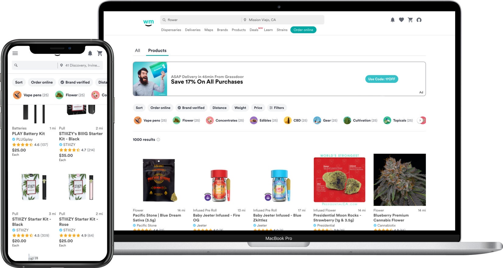
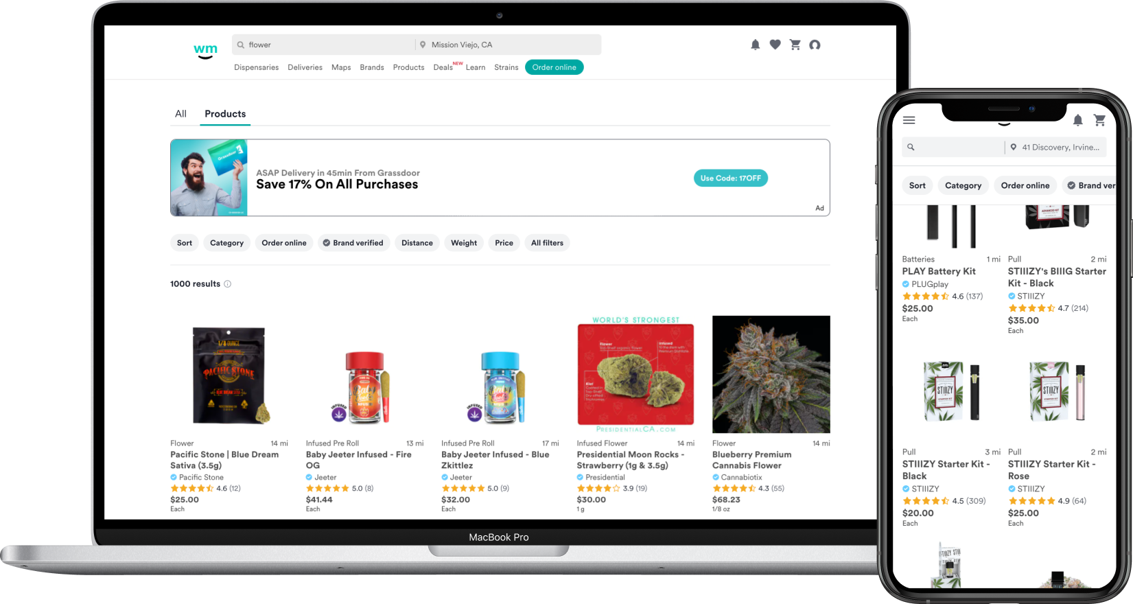
The current filtering experience on SERP (search engine results page) is unlike any other on Weedmaps. On initial load, only category filters are displayed while all other filters are hidden in the advanced filter drawer. The categories are also dynamic, dependent on the users query, and leads to a personalized but sometimes lesser experience. This filtering behavior can lead users down an overly reductive path with no easy way to clear or reset all the filters. So we asked ourselves—how might we streamline the filtering experience and design it so that it can be reused across all surfaces at Weedmaps?
Goals
- Make filters more accessible and easy to use
- Unify filtering experience by designing a reusable UX/UI component, starting with SERP (followed by listings)
- Clean up visual noise contributing to confusion at the top of the page
Initial research
Quantitative
Most popular filters
The most popular filters on both SERP and listing menus include categories, weight, and price. The majority of which are category selections (specifically L1’s).
- Category
- SERP 53%
- Listing menus 66%
- Weight
- SERP 7%
- Listing menus 9%
- SERP 7%
- Price
- SERP 7%
- Listing menus 7%
- SERP 7%
Qualitative
A regular piece of feedback we received from user testing was how confusing the top half of the page was.
- Users were confused about the "Did you mean" chips and if they had any impact on the product results below
- The banner ad was often confused as part of the product results
- The filters were difficult to find among all the elements on the page. They weren't as obvious as users would've liked.
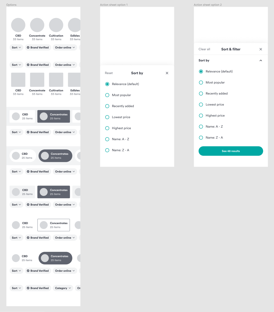
Early concepts and explorations
User testing
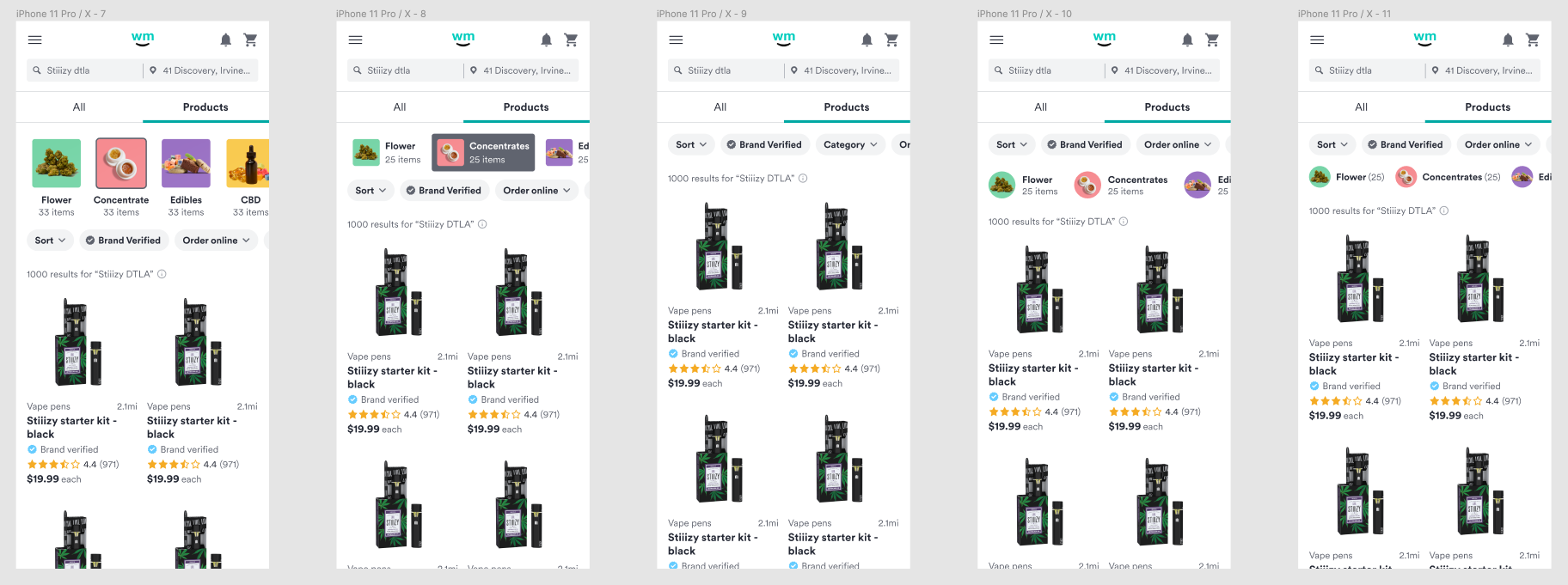
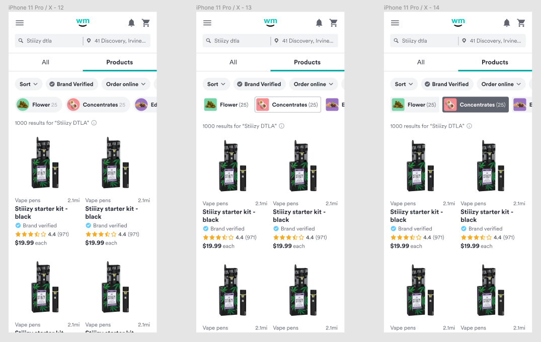
After the team had decided on two concepts, it time to get feedback through user testing. The goal was to make sure both concepts were usable and to see how they compared to the current filtering experience—were they easy to use? which one did users prefer? The test was done with 5 participants using balanced comparison, which let's you counterbalance two different experiences through usertesting.com.
Key insights:
- Participants had no problems navigating and understanding either concept
- Participants liked Concept A better than the current filters
- Participants liked the current filters better than Concept B, almost unanimously
- Participants liked the new action sheet better, generally
Notes and considerations:
- Exposed categories on the current filtering experience looks easy at first. It's not until you start using them extensively that you really find yourself stuck.
- There was bias towards the current filters because they were fully functional compared to the concepts that were prototypes.
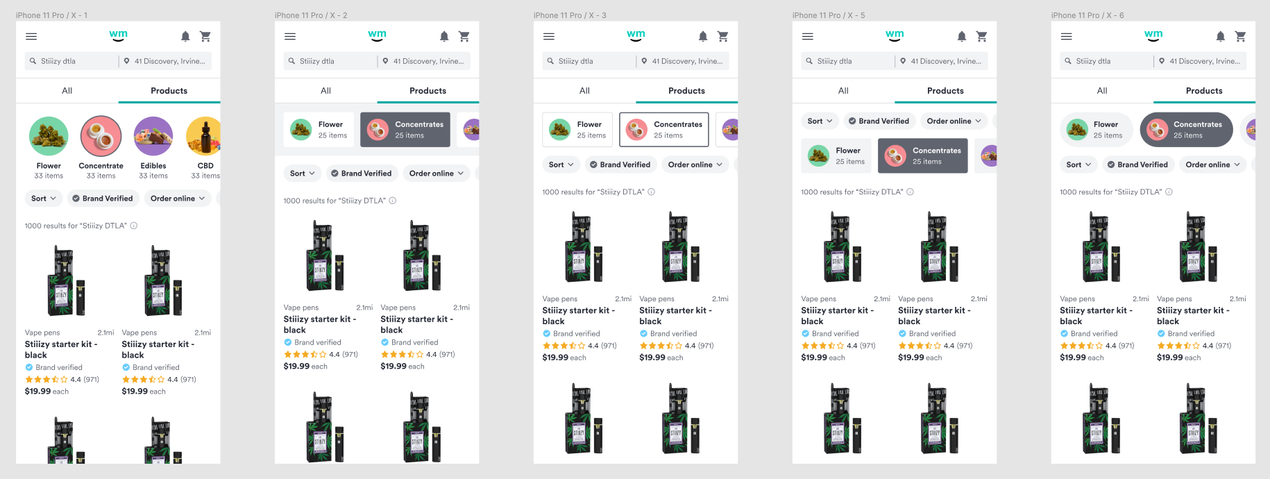
A new and improved filtering experience
Designed to be easy to use, understand, and access, the two new filtering experiences provide users with:
- Access to the most used filters without having to open the all filters drawer
- An easy way to clear filters by way of dismissible chips and a clear path backwards
- The ability to see all filter groups when one group selected
Experimentation
A/B testing
The team will be testing the two new filter experiences. The experiment will run for 10 days.
Metrics we'll be looking at:
- Product clicked
- Menu item clicked
- Filter clicked